
I follow a number of right-leaning websites, largely because I like to get all points of view. A few days ago, I saw a post on Steve Sailer’s blog about a study by Angus Deaton and Ann Case which indicated that death rates among whites aged 45-54 in the USA jumped significantly in the years 1999-2013, a jump which contrasted with steady declines in mortality among other demographic cohorts in the USA and elsewhere. Mr Sailer has followed this post up here, here, here and here; the significance he finds in the topic can be found in the titles of his first and fifth posts: “#WhiteLivesDon’tMatter” and “Why Wasn’t the Big 1999-2002 Rise in Death Rate Among 45-54 Year Old Whites Noticed Until 2015?” Other conservative bloggers have found great significance in the conclusions Professors Deaton and Case have drawn; for example, Rod Dreher sees in these figures signs that life is losing its meaning for poor whites in the USA, while Anatoly Karlin sees an ominous parallel to the decline and fall of the Soviet Union.
Columbia University statistician Andrew Gelman points out a problem with the analysis on which Professors Deaton and Case have based their conclusions. In 1999, the median age within the 45-54 years old subgroup of US whites was a lot closer to 45 than to 54, while in 2013 it was much closer to 54. The Deaton and Case study does not adjust for this difference in age distribution. Deaton and Case give us this spectacular graph:

Correcting for age distribution alone, Professor Gelman produces this figure:
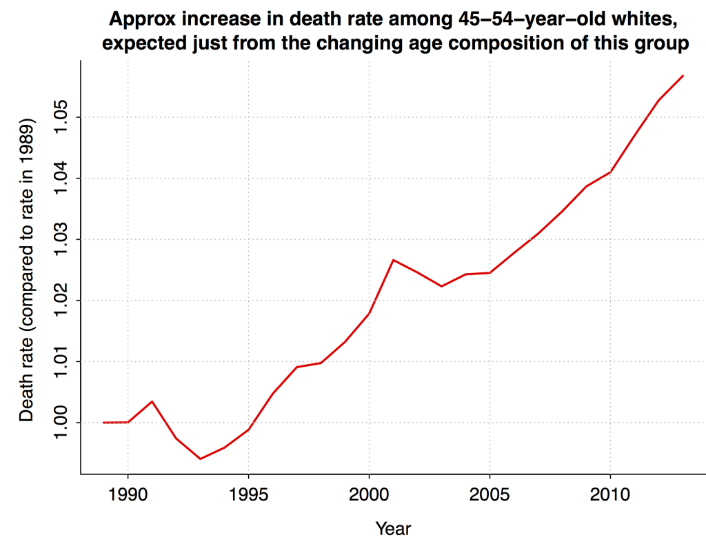
Which accounts for the entire effect illustrated by the bright red line in the Deaton/ Case paper.
Professor Gelman argues that the Deaton/ Case findings are still newsworthy, if not as sensational as their interpretation would suggest. Why did mortality among US whites aged 45-54 remain steady in years when virtually every comparable demographic experienced a significant decline in mortality?
I don’t know the answer to this question, but I suspect it will turn out to be something pretty obvious. My first thought is base rate. After all, middle-aged white Americans are, on average, one of the most prosperous large groups on earth, and have been so for a great many years. That isn’t to deny that pockets of deep poverty like those which so concern Mr Dreher do exist among US whites at the left end of the income distribution curve, but the income level at the middle of the white American bell curve is quite high by global standards and has been for many generations. So, any easy measures that could move the needle up on average life expectancy among a population have probably long since been taken with regard to middle-aged white Americans.
The second thing that comes to my mind is obesity. Americans in general are pretty fat; this animated gif that the Centers for Disease Control and Prevention released a couple of years ago illustrates just how fat we’ve been getting, and whites are certainly not immune to the problem:

If the median white American gained as much weight as this figure suggests in the years leading up to and beyond 1999, it is a sign of extraordinary advances in medical care that the mortality rate among US whites aged 45-54 did not jump by at least as much as the original Deaton/ Case interpretation indicated. That other groups actually experienced declines in mortality while undergoing equal or greater increases in obesity would support the base rate explanation to which I referred above, that African Americans and nonwhite US Hispanics, having on average lower incomes than US whites, were also on average later in receiving new forms of medical intervention and other benefits of modernity than were their white compatriots.
