A lottery that has never paid out

Andrew Gelman writes a fine blog, but he shares the bizarre fixation on instrumental voting that clouds the thinking of so many in the USA. He keeps regurgitating a pained argument, based on the idea that voters are like buyers of lottery tickets. The voter wins the lottery if s/he casts the decisive vote in the election. Since Professor Gelman trots this out to discuss US presidential elections, in which over 100,000,000 votes are cast, he can apply this argument only by resorting to extremely unlikely scenarios. So, he calculates the likelihood that Oklahoma will be decided by a single vote and that Oklahoma’s Electoral Votes will be decisive as 1 in 1 billion. If the better of the two leading candidates adds a cumulative $30,000,000,000 of value to the lives of the world’s people beyond what the worse candidate adds, or subtracts that much less value, then each of the popular votes for president cast in Oklahoma is like a ticket that would be valued at $30 in a fair lottery.

This is of course insane.  For one thing, if you’re going to admit 1 in a billion chances as a basis for rational action, all sorts of things become rational. For example, there is a 1 in a billion chance that Green Party nominee Dr Jill Stein will be inaugurated as president on 20 January 2017. Say there is 1 chance in 50 that tomorrow’s election will end in a 269-269 Electoral College tie.  1/50 seems like a reasonably conservative estimate for a map like this:


Click the map to create your own at 270toWin.com

Washington state Democratic elector Robert Satiacum has said that he will not vote for Hillary Clinton; if, as is overwhelmingly likely, Washington state votes for the Democratic candidate, let’s say Mr Satiacum has a 50% chance of voting for Dr Stein, a candidate who fits his views quite well. Now, the parties choose electors who are reliable supporters of the party’s regular candidates; Hillary Clinton is very much a regular Democratic candidate of the variety that has been on the market for the last quarter century, while Don-John of Astoria is markedly different from the usual run of Republican nominees.  So if there is one faithless Democratic elector, it is likely that there is more than one faithless Republican elector.  It seems unlikely that there is much more than 1 chance in 10, in the scenario as we have constructed it so far, that Mr Satiacum’s vote would be sufficient to qualify Dr Stein as one of the top three Electoral Vote recipients, the group from among whom the US House of Representatives must choose the winner of an inclusive election. So that gets us to a 1/1000 chance that the House will be presented with a vote of Trump 269- Clinton 268- Stein 1.

If the Democratic presidential candidate fails to win a clear victory, it is unlikely that the Democrats will gain enough seats in the House to defeat Don John. Let’s set that likelihood at 1/1000 also. That gets us to 1/1,000,000.

Hillary Clinton is a mortal being, subject to all the frailties flesh is heir to. In the interval between the Electoral College vote and the congressional vote, she may fall gravely ill, or be abducted by aliens, or have a religious awakening and decide to devote the remainder of her life to Hare Krishna, or otherwise become unavailable. Let’s set the odds of some such development at 1/1000. Little as they may love Dr Stein or the Greens, the Democrats could hardly vote to install Don John as president. That gives us our 1/1,000,000,000 chance of a Stein presidency.

Absurd? Of course. The absurdity level starts far above 1/1,000,000,000; even the 1/ 1000 long-shots are not worth a thought.

As I’ve said before, instrumental voting of the kind Professor Gelman treats as the only worthwhile kind is reasonable only in electorates of fewer than 700. Expressive voting, however, has value even in very large electorates, and there is no lottery about it. Office holders seeking reelection and other leaders of major parties do in fact look at election returns in search of votes they could gain or lose depending on what policies they support; votes cast for minor parties with clear issue profiles are among the inputs which provide them with this information. When the major parties become too much alike, this is the only way voters can signal a desire for them to move apart, as voters signal when they believe the parties have become too different from each other by switching from one major party to the other. So, the only rational vote you can cast is a vote for the candidate who best reflects your views, whether that candidate is supported by a major party or a minor one.

Twilight of the Honkies?

I follow a number of right-leaning websites, largely because I like to get all points of view.  A few days ago, I saw a post on Steve Sailer’s blog about a study by Angus Deaton and Ann Case which indicated that death rates among whites aged 45-54 in the USA jumped significantly in the years 1999-2013, a jump which contrasted with steady declines in mortality among other demographic cohorts in the USA and elsewhere.  Mr Sailer has followed this post up herehere, here and here; the significance he finds in the topic can be found in the titles of his first and fifth posts: “#WhiteLivesDon’tMatter” and “Why Wasn’t the Big 1999-2002 Rise in Death Rate Among 45-54 Year Old Whites Noticed Until 2015?”  Other conservative bloggers have found great significance in the conclusions Professors Deaton and Case have drawn; for example, Rod Dreher sees in these figures signs that life is losing its meaning for poor whites in the USA, while Anatoly Karlin sees an ominous parallel to the decline and fall of the Soviet Union.

Columbia University statistician Andrew Gelman points out a problem with the analysis on which Professors Deaton and Case have based their conclusions. In 1999, the median age within the 45-54 years old subgroup of US whites was a lot closer to 45 than to 54, while in 2013 it was much closer to 54.  The Deaton and Case study does not adjust for this difference in age distribution.  Deaton and Case give us this spectacular graph:

Screen-Shot-2015-11-05-at-7.53.11-PM

Correcting for age distribution alone, Professor Gelman produces this figure:

births4-1024x805

Which accounts for the entire effect illustrated by the bright red line in the Deaton/ Case paper.

Professor Gelman argues that the Deaton/ Case findings are still newsworthy, if not as sensational as their interpretation would suggest.  Why did mortality among US whites aged 45-54 remain steady in years when virtually every comparable demographic experienced a significant decline in mortality?

I don’t know the answer to this question, but I suspect it will turn out to be something pretty obvious. My first thought is base rate.  After all, middle-aged white Americans are, on average, one of the most prosperous large groups on earth, and have been so for a great many years.  That isn’t to deny that pockets of deep poverty like those which so concern Mr Dreher do exist among US whites at the left end of the income distribution curve, but the income level at the middle of the white American bell curve is quite high by global standards and has been for many generations. So, any easy measures that could move the needle up on average life expectancy among a population have probably long since been taken with regard to middle-aged white Americans.

The second thing that comes to my mind is obesity.  Americans in general are pretty fat; this animated gif that the Centers for Disease Control and Prevention released a couple of years ago illustrates just how fat we’ve been getting, and whites are certainly not immune to the problem:

If the median white American gained as much weight as this figure suggests in the years leading up to and beyond 1999, it is a sign of extraordinary advances in medical care that the mortality rate among US whites aged 45-54 did not jump by at least as much as the original Deaton/ Case interpretation indicated.  That other groups actually experienced declines in mortality while undergoing equal or greater increases in obesity would support the base rate explanation to which I referred above, that African Americans and nonwhite US Hispanics, having on average lower incomes than US whites, were also on average later in receiving new forms of medical intervention and other benefits of modernity than were their white compatriots.

And they’re off!

So the results are finally in from the 2012 US presidential election, or as it is also known, the first tracking poll for the 2016 US presidential election.

In the last couple of days, I’ve posted a few comments in miscellaneous places making guesses about 2016.  On political science blog The Monkey Cage, I responded to Andrew Gelman’s prediction that the Republican and Democratic nominees in 2016 would be Paul Ryan and Hillary Clinton thus:

The Republicans have a strong history of settling on a presidential nominee early, and defeated vice-presidential candidates need time to put space between themselves and the slough of resentment that follows a loss. So I’d say that Mr Ryan is very unlikely to be the Republican nominee in 2016. The Democrats tend to look for fresh faces and to favor youth; someone like Ms Clinton, who has been a household name for decades, would therefore labor under a disadvantage in a 2016 bid, though her odds would surely not be as long as those confronting Mr Ryan. If I had to guess, I would say a likelier pair of finalists would be Mike Huckabee for the Republicans and Martin O’Malley for the Democrats. I hasten to add emphasis to the words “guess” and “likelier”; I’d be surprised if that were the matchup, just not quite as surprised as I would be to see a Clinton vs Ryan contest.

In response to a post by Daniel Larison on The American Conservative’s website, I expressed the same surmise about Mr Huckabee.
In response to another of Mr Larison’s posts, I explained why I don’t think that the Republicans will be nominating any Mormons for president any time soon.


We’re still here

Hmm, been a bit of a hiatus since the last post.  But we’re still here.  Here are a couple of links to interesting things:

Andrew Gelman has redesigned his blog; same material, but a fresher look and you no longer have to go through the back door to link to individual posts.  A couple of days ago he put up a terrific post called “One of the easiest ways to differentiate an economist from almost anyone else in society.”  He wonders why it is that so many economists can simultaneously believe these two things:

1. People are rational and respond to incentives. Behavior that looks irrational is actually completely rational once you think like an economist.

2. People are irrational and they need economists, with their open minds, to show them how to be rational and efficient.

Anatoly Liberman, the Oxford Etymologist, put up a nice little piece in May about the odd career of the letter “H.”  I must register one small demurrer concerning this piece.  Liberman writes:

Everything would have been fine if th were not also used in Greek words for rendering the letter theta. We have it in such monstrosities as phthisis and chthonic.  Very few people are so pedantic as to pronounce the initial consonants in them, but th is part of both words.

Surely the charge of pedantry holds no terrors for anyone who speaks the words phthisis and chthonic aloud, and gives them no motive to suppress the initial consonant of either word.  Come to think of it, I’ve had occasion to pronounce the word chthonic a few times while teaching classes in which it came up, and I did say it very much as I would have if it were spelled χθωνικ-.*

A post on “Understanding Uncertainty” appears to be about mobile phones and brain cancer, but comes to this twist ending:

The moral of this story has nothing at all to do with mobile phones or cancer. It is that you can’t get a full story of what’s going on on a health issue by simply following what’s in the mainstream media. What you’ll find there is not necessarily what you want to read, but what other people want you to read.

Be careful out there!

*I know there’s supposed to be an acute over the omega, but WordPress doesn’t do diacriticals well enough to make it worthwhile.

“Great Universities” and “Great Cities”

The other day, I made a long comment on a post at the blog commonly known as “Gelman.”  The original post is by the blog’s namesake, Professor Andrew Gelman.  Gelman referred to a newspaper piece by Professor Edward Glaeser on the idea of developing an applied sciences center in New York City.  Glaeser makes some rather strong claims for the power of universities to promote economic development in the cities to which they are attached.  Blogger Joseph Delaney had put something up in which he expressed doubts about Glaeser’s general claims, challenging those who would defend them to explain why New Haven, Connecticut, home of Yale University, is such a dump.

Gelman is impressed by Delaney’s post.  He also picks up on a paragraph in Glaeser’s piece that includes a quote from New York’s late US Senator Daniel Patrick Moynihan:

The late Senator Daniel Patrick Moynihan of New York is often credited with saying that the way to create a great city is to “create a great university and wait 200 years,” and the body of evidence on the role that universities play in generating urban growth continues to grow.

Gelman doesn’t dwell on Moynihan’s words; he makes it clear in the comments (here and here) that what really interests him is the question of the economic impact of universities on their urban environments in the (moderately) long run.  Many other commenters (for example, this person) expressed doubt as to whether any answer to the question could be tested quantitatively, considering how few “great universities” and “great cities” there are at any point in time.  In my comment, I suggest that if we take Moynihan’s words literally (admittedly, a rather silly thing to do) we might be able to develop a quantitative test of his hypothesis:

Well, if we take Moynihan’s claim literally, what we need are two lists: a list of “the great universities” as of year n, and a list of “the great cities” as of year n + 200. Of course we wouldn’t want to top-of-the-head either of those lists, so as to avoid some kind of Clever Hans effect.

I haven’t looked for any list that anyone has put forward of “the great universities” as of any particular year, but it sounds like the sort of thing many historians would be fond of producing. And lots of people like to make lists of “the great cities.” Once we have a list, however subjectively it was generated, we can look over the items, try to find quantifiable characteristics that most or all items on it share, and having found such characteristics we can refine the list by adding other items that share them or deleting items that don’t share them. So we can try to work backward to foundations.

As for Yale, I doubt very much that you could find any reasonable criterion by which it either was or had been a “great university” in 1811. Nowadays, sure, but in its first centuries it was a backwater. Would any American university have qualified as “great” in 1811? The faculty of the College of New Jersey, later renamed Princeton University, had been home to quite a few distinguished scholars from Edinburgh in the late eighteenth century, and Columbia had produced a lot of impressive alumni by 1811. Still, it would seem a bit much to call either of them a “great university” at that early date.

Other commenters, such as universally beloved public figure Steve Sailer,  have brought up the idea that it isn’t great universities that make the cities attached to them great, but great cities that make the universities attached to them great.  Here again, I’d ask to see two lists: the world’s “great cities” as of year n, and the world’s “great universities” as of year n + whatever number you like. New Haven continues to be a counterexample; while Yale may never have been on any list of the world’s “great universities” until the middle of the twentieth century, it undeniably has a place on any such list today.  Yet New Haven has never been anyone’s idea of a “great city.”  How many seats of the “great universities” have been?

Of course, one challenge in analyzing such lists would be deciding which universities are attached to which cities.  It may not be controversial to say that Cambridge, Massachusetts is part of Boston, and so to give Harvard as an example of a (currently) great university located in (what I’d call) a great city; but what about San Francisco and the two great universities in the Bay Area?  Is Berkeley really part of San Francisco?  You go through Oakland to get from one to the other, and Oakland is most definitely not part of San Francisco.  Is Palo Alto part of San Francisco?  The relationship between Stanford University and San Francisco is often cited as one of the things that makes that city great, but Palo Alto is in fact 35 miles from San Francisco at their closest points, and Stanford’s campus is further than that.  San Jose, a very different city, is only half as far, and it’s southward to and beyond San Jose that Stanford-based tech entrepreneurs have usually gone.


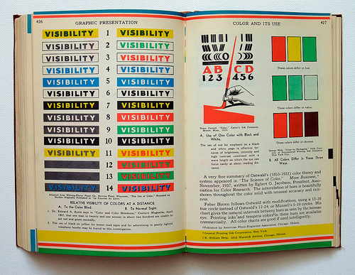
Graphic Presentation by Willard Cope Brinton

Reading the blog commonly known as “Gelman,”  we learned that Michael Stoll posted on Flickr a collection of images from a remarkably attractive 1939 book called Graphic Presentation, by Willard Cope Brinton.  Evidently hundreds of other bloggers have already found this collection and ripped images from it; why should we be any different?  As always, we’ve linked each picture to the place where we found it.